Four Steps to the Perfect Correlation Coefficient
April 6, 2021, 9:22 a.m.

Whether you are a scientist, innovator, software engineer, or any other species of researcher, "Our study shows a strong correlation between this and that," is one of the most sought after statistical conclusions. Often the entire purpose of the research project is to show that two variables are related in some way. This result can be a conclusion for a high-impact publication, a springboard for ground-breaking research, a green-light for development of an innovative product, or even a gateway to a Nobel Prize.
One of the most common questions I get asked as a statistician is to look for correlation between two variables. Whether it is looking at correlation between learning style and test results, age and blood pressure, or type of landing page and creating a user account correlation is one of the most useful conclusions we can make about our data. Unfortunately, the use of the word correlation is often misunderstood.
The correlation coefficient test statistic is one of the most common statistics researchers use to prove the relationship between two variables. The statistical test is simple, intuitive, and involves very few statistical assumptions. However, it is also one of the most frequently misused statistical tests. It is not uncommon for researchers to choose the wrong test, misinterpret the results, or make the wrong conclusions. Luckily, it takes just a few minutes to understand the test and avoid these problems.
In this post we will talk about the pitfalls with the correlation coefficient, and give a simple four-step process that can fast-track your research study to meaningful high-impact conclusions.
Step 1: Choose the Right Test
The correlation coefficient is an excellent test to look at the relationship between two numeric variables, but there are several important cautions. Firstly, the two variables must be numeric; they need to be a measurement of something. For example, temperature, time to complete a sign-up process, or score on a multiple-choice test are all numeric variables and could be analyzed by the correlation coefficient. Secondly, the primary purpose of the test is to ascertain a relationship exists between the two variable. The correlation coefficient does not give a way to predict one variable from another: that requires some sort of regression model. In addition, although the correlation coefficient can prove association, it does not necessarily prove causation: that requires some type of randomized design as we discussed in a previous post.
When setting up the data for the correlation coefficient, which variable is labelled as x (the traditional independent variable or factor) and which is labelled as y (the traditional dependent variable or response) is entirely arbitrary. The value and interpretation of the resulting correlation coefficient is the same either way.
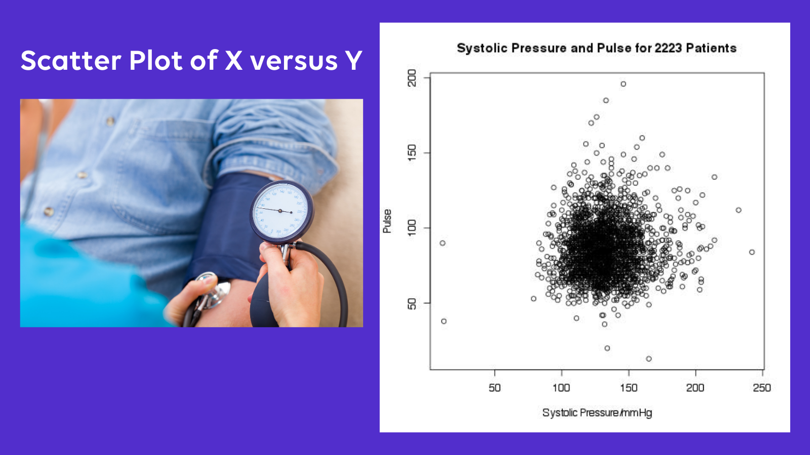
As an example. Suppose a researcher is interested in developing a new triage method. He would like to minimize the number of variables used in his new protocol, so is looking for factors that can be ignored. His hypothesis is that there is a strong correlation between systolic blood pressure and pulse. If his hypothesis is true, he will feel justified in including only one of the variables in his triage model. He discusses with his statistician. As the measurement of both blood pressure and pulse are numeric, and he is interested in determining a relationship but not a prediction model, they choose the correlation coefficient as the best test.
Step 2: Interpret r
The correlation coefficient is traditionally labelled as r, and it measures the degree of correlation between the two variables. The coefficient can range from -1 to +1, and is interpreted as:
- r = -1: Perfect negative correlation
- r = 0: No correlation
- r = +1: Perfect positive correlation
An important note here is that r is interpreted differently than most other statistics. Getting the result of r near 1 is an excellent and important result, it means that as x increases, then y increases as well. For example, imagine studying the relationship between shoe size and height, as shoe size increases so does height. Getting the result of r near -1 is also a significant result - indicating that as x increases y decreases in exact proportion. An example of a strong negative correlation might be time for a web page to load and number of clicks on the signup button. A common error among researchers is to consider -1 as a "not significant" result. In fact, values near zero indicates a lack of correlation. How close to zero? A common way to interpret the correlation coefficient is to look at the absolute value of r:
- |r| < 0.5: Weak Correlation
- |r| > 0.8: Strong Correlation
- Anything else: Unclear
The magnitude of r also indicates to what extent the value of one variable is predictive of the other. The value of r squared, is equal to the r-squared statistic of simple linear regression. For instance, an r-squared value of .9 would suggest that approximately 90% of the variation in one variable can be predicted by the other.
Let's take another look at our example researcher and his project to build a better triage model. He measured both the blood pressure and pulse in 2231 patients presenting to the emergency department. The calculated r is 0.05. This indicates a weak positive linear correlation between pulse and blood pressure. The r-squared value is 0.003, meaning only 0.3% of the variability in the pulse can be explained by the blood pressure. Our researcher is forced to conclude that the relationship between pulse and blood pressure is weak, and removing one or the other of the variables from his triage model is not justified.
Step 3: Interpret the p-value
Most statistics software will provide a p-value when the correlation coefficient is calculated. As always, this p-value indicates the likelihood of attaining data at least as extreme as those in the sample data given that the null hypothesis is true. And, as always, the p-value is exquisitely sensitive to the null-hypothesis chosen by the researcher. What is the null hypothesis? This depends on how you set up your statistical test. Setting this up incorrectly is a very common mistake for researchers that can quickly kill your statistical analysis.
Whenever you have a p-value you have a null and alternative hypothesis. The definition of p-value is dependent upon these hypotheses. This is basic statistical theory. Unfortunately, most statistics software does not make this clear. If you use software to calculate a p-value, you have a null and alternative hypothesis. If you don't specify them, the software will often try to make a reasonable assumption about what they are. In the case of the correlation coefficient, most software will usually assume you mean to test the following hypotheses:
- H0: The true population correlation is 0
- HA: The true population correlation is not 0
As you can see, this is a pretty liberal interpretation of the correlation coefficient. A common misconception is that a small p-value indicates a strong correlation. This is not true. With large sample sizes correlation coefficients that are close to zero can have tiny p-values even if the magnitude of the correlation is trivial. How can you avoid making this error? Firstly, always interpret the p-value in the context of the correlation coefficient r. If the p-value is small, but the correlation coefficient is also small, you have simply proven that a weak correlation exists: not that it is useful. Secondly, look at the confidence interval for the correlation coefficient. If the limits include or nearly include zero, then your study has not proven useful correlation. Finally, consider altering the null and alternative hypotheses when calculating the test statistic. Perhaps choosing "the true population correlation coefficient is <= 0.5" as the null hypothesis and "the true population correlation coefficient is > 0.5" as the alternative.
For the triage project, our researcher calculates the p-value for his data, with the null hypothesis that r =0. To his delight, he finds a petite p-value of 0.01. Delighted to see the small p-value, he calls his statistician to say "we have a significant result!" The statistician, however, is much less excited. She calculates the 95% confidence interval for estimation of the true population correlation coefficient as 0.011 to 0.094. She explains to the researcher that the significant p-value only means that is unlikely that this result would occur by chance if blood pressure and pulse were completely unrelated. In fact, it is likely that there is some relationship between the two, however, as the calculated r is very close to zero, it is unlikely that the extent of the relationship is useful. She explains that the large sample size makes it easy to find a significant p-value even when the magnitude of the correlation is not useful.
Step 4: Plot the Data
No matter what value of the correlation coefficient is found during the statistical analysis, it's always wise to spend a few minutes plotting the data to gain further insights.
As correlation coefficients are always testing the relationship between two variables, it is simple to set up a scatter plot of one variable on the x-axis and the other on the y-axis. Remembering that the choice of which is x and which is y is arbitrary. What will the scatter plot show? Depending on the nature of the relationship, scatter plots can appear dramatically different. In the case of a strong positive correlation, we would expect to see the plotted values form a line with a positive slope (going up). The stronger the correlation, the closer to a perfect line. In the case of perfect negative correlation, there should be a line with negative slope.
What if the correlation coefficient is close to zero? What does the plot look like? In this case, the plot can be very informative, as small values of correlation coefficients can come from a number of different scenarios. For instance, there may be a horizontal or vertical line indicating that one of the values is always the same, and does not vary under the experimental conditions. You would see a plot like this for instance if you looked for the correlation between number of eyes and height among university students. Alternatively, you may see the points appear to be evenly distributed throughout the plot, in a seemingly "random" pattern, indicating that the value of one variable does not appear to be at all related to the other. For instance, if you plotted the customer's height versus the gas mileage of their car.
Strangely, the correlation coefficient can hide strong but non-linear relationships. The mathematics of the correlation coefficient statistic is looking for a linear relationship. Plotting the data can reveal U-shaped or other non-linear relationships that may be important. For instance, imagine plotting running speed versus age for all customers at a shoe store. Imagine the customers range in age from 5 to 95 years. It is likely that the plot would be a type of inverted-U with the fastest runners in the middle of the age range. It may even be possible to develop an accurate prediction model using a non-linear regression. Still, the correlation coefficient here may be very close to zero as no strong linear relationship exists.
In our example, the triage researcher decides to draw up a simple scatter plot of blood pressure versus pulse. A quick look at the plot reveals, as the statistician had suggested, that there is no useful relationship between pulse and blood pressure. Our researcher finds the plot very useful - it demonstrates a common hazard of using the correlation coefficient: small p-values do not prove a useful relationship.
Sticking to the Four Step Plan
The correlation coefficient is a fantastic statistical test. It is easy to calculate. It is valid across a broad range of circumstances, and makes minimal assumptions about the population. Not only that, but it can be used in a variety of experimental circumstances. The correlation coefficient, unlike many other statistical tests, is easy to understand from an intuitive human perspective. Even non-statisticians have an intuitive sense of correlation, and almost everyone will understand the terms "highly correlated" and "lack of correlation."
Sadly, it is this intuitive nature of the correlation coefficient that makes it so easy to misuse. If you are planning to use the correlation coefficient in your analysis, follow the four-step plan. First, make sure you are using the correct test by ensuring you understand the nature of what the test can prove. Secondly, look closely at the value of the coefficient and interpret it cautiously using the guidelines above. Thirdly, if you are calculating a p-value, check your null and alternative hypotheses and make conclusions about the significance of the test carefully. And, finally, plot the data to confirm your conclusions, look for other types of non-linear relationships, and provide clarity to the readers.
Are you looking for a quick way to become a pro at the correlation coefficient? Get our i infographic checklist that summarizes the four steps in an easy-to-follow recipe.
Are You Ready to Increase Your Research Quality and Impact Factor?
Sign up for our mailing list and you will get monthly email updates and special offers.